The thought of the Avatar kids in Pokemon style hit me as early as the end of Book 1 or something like that. I even printed out the reference for most of the characters, but I didn't want to start yet since I was kind of aware that Zuko would be getting a new hairstyle (and possible a better main outfit than the Fire Nation uniform), and I didn't want to get spoiled from looking for reference, so I decided to wait until I finished the series.
Seriously though. I just don't get it, why must it be so difficult of the creators to publish some official art of the main characters, just standing there, so I could use them as reference? They... They should think of artists and cosplayers and stuff! But since it's too difficult to find a nice official art of a whole body picture of the characters just standing there with a white background, I'll have to settle with LQ screen shots.
|
Aang
|
|
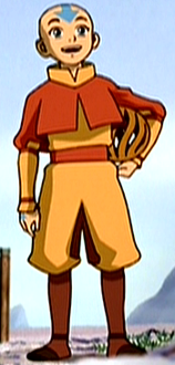
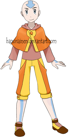
I was uncertain about the poncho, but since an official pokemon character has one I thought that it's ok. And it's quite a large part of his original character design anyway, and I don't think I would have been able to think of what else to do with him if I couldn't have used it.
I wanted to give him a more energetic pose, like jumping, but it refused to turn out right. In the end I concluded that it's better to give them all a boring standing one instead; If Aang's pose was somehow special I'd have to put more effort to all of them to prevent him from sticking out overshadowing the others.
Originally I forgot the tattoos on his arms and legs and didn't even think of them until a visitor pointed out my embarrassing mistake. I decided to erase the lineart of the tattoos though; they looked really silly. Now there's the other silly thing that the arrow in the head has lineart while the others don't... Maybe I should have given the head arrow the same treatment.
|
|
Katara
|
|
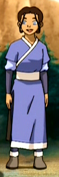
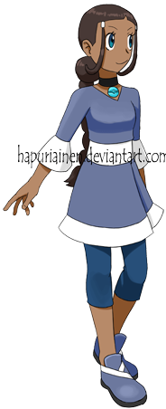
This could have turned out a lot better, but overall I'm kind of pleased. The dress looked nicer in the "sketching random ideas on a scrap paper" doodle though... And you could see the shoes better, I was a bit disappointed how I randomly gave her a pose that hid the other shoes. But the shoes are supposed to be from the dress collar if you can't tell.
In my original idea she had a scarf wrapped around her waist as a belt. I thought it'd give the design something unique, and she IS from a cold place so scarf would be kind of justified. But it just wouldn't turn out well, and even if she is from a cold place she doesn't use a scarf, and it wouldn't even show in the pose I ended up giving her, so I had to give up on it. But it would probably have looked pretty stupid anyway so maybe this is better.
Turning the necklace into a pokeball was kind of too easy and obvious, but since it's such a big part of her character I thought it'd be stupid to leave it out.
|
|
Sokka
|
|
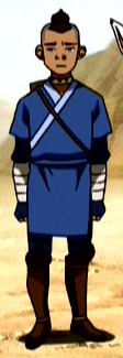
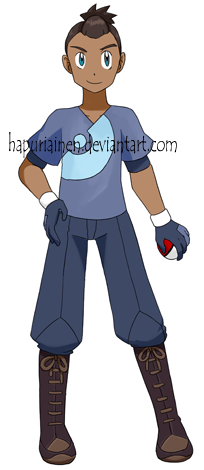
The Sokka design has a lot of stuff going on and most of it don't really go together. I just couldn't think of what to do with him, his pants/shoes were kind of boring and generic, while the top was very similar to what Katara had (she was designed first). So I had to think of two different things to do with it, and since I'm not good at designing male clothes, my beloved Sokka got the shorter end of the stick.
In the end I don't know what I think of the shirt. I think it's either a great invention that combines the original and pokemon designs, or a really lame and boring idea. He almost got the shirt I originally thought for Katara, but it got scrapped again. It was supposed to have a collar and a white line going down in the middle, like Red's shirt.
I was trying to imitate his weird gloves, but the design didn't turn out that well. The pose turned out even less well since you can hardly see the detail on the gloves. And I think it's a bit shame I didn't use his necklace, but since I already gave one for Katara I didn't want to repeat myself.
|
|
Toph
|
|
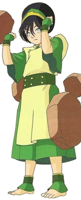
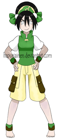
She was by far the easiest to design, and undoubtedly the most succesful of this bunch if you ask me. The original design was already kind of very pokemon-like so there wasn't even much I needed to do, but I think I managed to get far enough from the original so it's a new design and not just the same outfit drawn in a slightly different style.
I was a bit unsure about the ribbons in the headband, but now I'm quite pleased with them. They the headband more different from the original, and they give it a nice little feminine touch.
The pattern in the headband was practically begging to be turned into a pokeball.
I don't think if a pokemon trainer should be going around barefeet, but I had to give in since it would have been a horrible blasphemy to draw her shoes. But her feet are tiny in my drawing...
|
|
Zuko
|

|
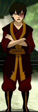
And here's the one who caused me the most problems. I had absolutely no ideas what to do with him, and I'm not pleased with the boring outcome at all, but apparently the visitors have liked it.
After much pondering I only had a few ideas, namely "long pants, sleeveless shirt above a dark t-shirt". In the end the sleeveless shirt turned out to resemble Red's too much to my liking. Overall I think that the problem with this design is that it just doesn't have anything special or interesting in it, while the others have had at least one thing to draw your attention (I consider them to be Aang's poncho, Katara's dress, Sokka's shirt pattern, and Toph's hat for the Pokemon Gaang).
I was hoping I could have used the pattern on the shirt hem somehow, but the reference I had printed was too blurry, and I don't think I would have been able to do much with it even if it had been better. So he got random generic flames to his pockets instead.
Originally I was about to commit a crime even more horrible than forgetting Aang's tattoos: the character was already sketched when I noticed that I had given him two normal eyes (and two eyebrows). Luckily I managed to fix that mistake before uploading the pic, failure would have been extremely embarrassing.
|
Back
|
