(new navigation system / layout under construction) | |
| Dress ups / Drawings / Manga stuff / Reviews / Other / About / History / Links out / Guest Book |
(new navigation system / layout under construction) | |
| Dress ups / Drawings / Manga stuff / Reviews / Other / About / History / Links out / Guest Book |
|
Anastasia was supposed to be in the first batch since I like her quite a lot (and especially compared to the likes of Snow White, Cinderella and Aurora) who are very much "meh" to me), but I didn't want to deal with the "zomg anastasias not disney" comments I predicted drawing her in the same pic would cause. So she was left to the second piece, but when I ended up thinking of eleven more characters I thought it'd be good to split them to two pieces depending on whether they're Disney or not. |
| Snow White, from Snow White and the Seven Dwarfs | |
|
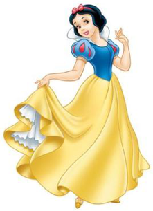
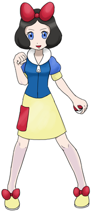
I often see her movie revered as the best Disney film ever. Never understood that, I found the character stupid and there was nothing that excited me about the film either. She was the only one to get the round "Skyla eyes" as I call them. The reason for that is probably because when I started drawing the first eight princesses I was had a plan involving more variety. In the end it didn't turn out too well so I decided to stick with the standard eye style. But I've never liked Snow White so I wasn't exactly interested in fixing her... I really, really, really wanted to use the red things on her sleeves, but that just didn't work out. I couldn't just copy them from the original, that would've been a lazy design, and I couldn't think of what else to do with them either. So I had to settle with a red pocket. How I shaded and coloured the hair is a bit off as Snow White was the first one I coloured and I hadn't yet grasped the idea how I should try to imitate the Sugimori style. That's why her legs are shaded slightly differently from the rest of the princesses as well. I was really happy how I could use the bow on her head. Dunno if the ribbons on the shoes are a bit too much, but at least they're cute? |
| Cinderella | |
|

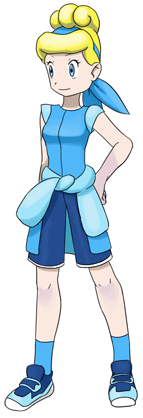
The movie left a very weak impression on me, but it got some points for at least being better than *shudder* Sleeping Beauty. Usually I do my best to sit through the whole movie when I watch it for the first time, but this time I had to resort to the forward button when it came to the antics of the dreadful mice sidekicks. This design possibly came out a bit too tomboyish but I still kind of like it. The colours turned out nice and fresh, and the general drawing somewhat resembles Sugimori artwork more than the other princesses on average. The hair is horrible though. I blame the original, I think her ballgown hairdo is stupid in the movie as well. Of course it's my fault for not choosing to use her peasant outfit hairdo though, but let's not go there. I like the idea for the shirt tied to her waist, even if I blatantly copied the exection from Candice. How the head thing could be turned into a bandanna so easily was nice too. The pants were initially a skirt, but that just didn't work out so I had to use a more boyish option, even if something girly would have probably fit the character better. They used to be lighter too, but it made the outfit look too much like a pajama. |
| Aurora (Briar Rose), from the Sleeping Beauty | |

|
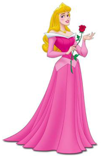
Aaand here comes my least favourite Disney Princess (explains a lot why her design turned out so bad). If I had known to watch the movie with the mentality "this is the Sleeping Beauty story from the fairies' point of view" I might have been a lot more tolerant about it, but how Disney markets her character and how her name kind of is in the title of the movie I expected the movie to be her movie. Sure, Snow White and Cinderella weren't exactly the most active heroines either but at least they were like, on screen. Anyway the design doesn't really have a theme that'd tie it together, it's more like random stuff thrown together. I'm fairly certain that the original outfit would have given material for a lot better design, but unfortunately I wasn't too interested in putting much effort to the character. I don't exactly get what's up with the hat. All the player characters have a hat, so I've tried to give some kind of headgear to my pokemon trainers as well. Someone had a hat design like this in my vast reference picture album and I decided to use it, but when I think of it now it might not have been such a good idea. The triangular pattern is supposed to represent the crown, it even was yellow at some point but that made the design even messier so I decided to stick with different shades of pink. Also, I hate pink so the blue dress is my favourite by default. But since this already had two blue outfits in Cinderella and Belle and I believe she's know better from the pink colourscheme I had to give in. I guess my least favourite colour is just good for my least favourite princess... If I had to say something good about the design it'd be the shoes, they turned out pretty nice. And the idea for the collar was pretty nice too. Also, the character's Briar Rose outfit is actually one of my favourites, so if I ever do an alternative piece with different outfits that will be one I'll definitely choose. |
| Belle, from the Beauty and the Beast | |
|
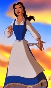
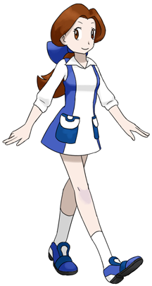
Beauty and the Beast seems to enjoy some kind of universal acclaim as a movie. I slightly disagree there; I don't think it's the best Disney movie evarrr (that'd be Mulan for me. Followed by Lilo&Stitch, Lion King and Tangled), BatB is in the "it was okay, but not something I'd want to buy to my own bookshelf" category. The Beast in his beast form and Gaston (especially his song) were awesome, but not awesome enough to support the entire movie, and I found Belle fairly boring and teetering on the edge of Mary Suedom. And "Be Our Guest" and anything involving the little teacup will be something I'll remember to skip when I watch the movie next time. Oh, right, abou the design. It's one of the most successful designs in the Pokeprincess project if you ask me. It's nice and simple but fun enough to be a pokemon outfit and not just a regular costume. It just... works. I like the pockets and how it's divided into blue and white and the hair bow and everything. I'd like it if the shirt and dress were a bit easier to discern; she's supposed to wear a long sleeved shirt and a sleeveless dress over it. This kind of breaks the general theme of giving the princesses their princess dress though (not counting Ariel). It's just that the blue dress is one of my favourite Disney outfits while I find the yellow thing pretty hideous. But it'd be nice to pokemonize that too. So far nobody has mentioned how the lines of her left leg don't exactly match... |
| Ariel, from the Little Mermaid | |
|
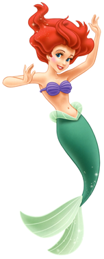
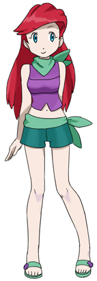
And here's the other girl who didn't get her princess dress. But that's okay, since we all know her and her colourscheme from the mermaid form and not from the pink thing don't we? I've seen some people comment that they would have give her a dress or skirt since pants are weird for a mermaid. That's a fine viewpoint too, but I chose to use pants because having legs was a central element in her story. Also, the mermaid theme kind of demanded a more revealing outfit, but I thought that a shirt showing the belly and a mini skirt would be too much. In general I tried to go for something you could wear on a warm beach. I think that a bandanna around your neck and a bandanna on your hips are nice ideas, but I really shouldn't have used them for the same character. Firstly, it's silly, and secondly, I could have saved the other for another character. I believe I had the idea to have them represent her tail, but I wish I had remembered to draw light green lines to them. Not too pleased with the shirt. I wanted to give it lines going vertically like here, but the seashell bra reference asked for horizontal lines instead. I've never understood how Ariel's bangs work, but hopefully what I could come up with is ok in the pokemon world where every other character has an insane hairstyle. You can't see it too well, but the purple things on her sandals are seashells. |
| Mulan | |
|
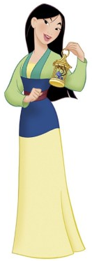
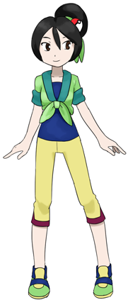
As of now my favourite Disney movie and princess I'm not quite happy with this, it doesn't do justice to her awesomeness. Maybe the pink matchmaker outfit would have given material to a more interesting outfit? The biggest problem with this is that it's pretty boring. When designing an outfit for any purpose I always try to give an outfit one or two "special" things, something fun you'd remember about it. For example for Tiana it's the shape of the skirt hem and hat pattern, and for Belle it's how the dress is divided into blue and white (and the pockets for #2). As for Mulan... There's not much. The only idea I had was how the shirt is tied, but it's not interesting a detail enough to support the whole outfit when there's nothing else to back it up. I remember that when I drew the sketch I was worried about how many colours the dress had so I tried to keep the detail in minimum to compensate for the overload of colours, but that turned out not to be the correct decision. The hairstyle at least attempts to be somewhat interesting but I'm not sure how well it manages it. I wonder if that's a real pokeball or just an accessory? |
| Tiana, from the Princess and the Frog | |
|
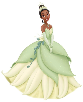
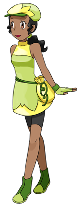
She did have the blue dress from Charlotte too, but I believe this is more iconic. I'd like to draw the blue dress too though. At first I didn't like this outfit at all, but by now it has grown on me. I do find it a bit messy still. My main problem with it is that it's going everywhere and has a lot of random elements that have little to do with each other. The idea for the hem design was decided from the start, but I had to redraw it more times than I would have liked. The flower thing on her waist was though; I wanted to include it but I couldn't figure out what I should do with it. I was against the idea of drawing a bag (none of the other princesses have one), but in the end I had to go for that anyway since I couldn't think of anything else. Or I tried to put a curly flowerlike accessory to her hat first, but that was just plain stupid. The curls are too thin for a pokemon design though if you ask me. Her hair gave me trouble, since I had already drawn a hat I liked so I couldn't use the hairstyle with a bun. So I picked a ponytail hairstyle from her commoner outfits instead. Now that I think of it, my main gripe with this might be the yellow colour after all. Should I have used a duller colour instead? But Pokemon characters have bright colours don't they? The legs have the same problem as with Belle. Embarrassing... |
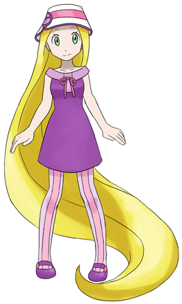
| Rapunzel, from Tangled | |
|
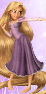
She's one of my favourite princesses and I'm pretty pleased with the design, even if it has next to nothing to do with the original outfit. But people can recognise her from the hair and the purple colourscheme so hopefully that's enough. The dress design is something I saw in my reference picture album, and I really really wanted to use it. Unfortunately I couldn't think of how to integrate it into Rapunzel's outfit, so my solution was "I'll forget Rapunzel's outfit then", which may not have been the best thing to do... I did have a weak attempt of trying to use the flower pattern from the dress somehow but it didn't work out too well. The top part that was lighter purple was completely forgotten, and the pink ribbon was a last minute addition in the "ugggh I have to take something from the original design" spirit. The stripes on the sleeves were something I wanted to use too, and I ended up giving her thights. It seemed like a brilliant idea back then, but as for now I'm not so sure any more. They used to be a lot darker in the colouring phase, but that was just plain silly so I did my best to hide the colours. The more I look at the hat the stupider it looks. |