They kind of break my naming convention but whatever. This'll probably cause me trouble if I draw more non-princess girls, because I don't want to call a picture "non-princesses 23" or something like that.
|
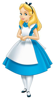
Alice, from Alice in Wonderland
|
|
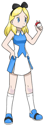
Originally I gave her pants, but then again I just can't think or Alice not wearing a blue and white skirt/dress (though I have to say that the new skirt looks better than the pants). That created a new problem since I already gave Belle a blue and white dress.
Not too pleased with the pose, aside from the hand holding the pokeball which I managed to draw without reference, I kind of like this. It's nice and simple, and the brighter blue differentiates it from the Belle design. The hair bow turned out a bit too Mickey Mouse ear-ish though...
At some point she had leg warmers but they just didn't work. I hope I'll get to use them for some other design instead. Also, the shoes had a spade style design (spade as in deck of cards), but it had too sharp and small corners that I had to remove them.
|
|
Wendy Darling, from Peter Pan
|
|
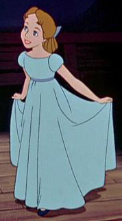
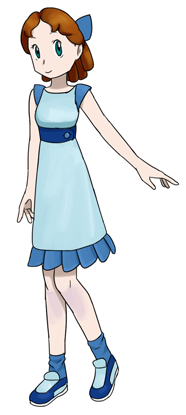
Wendy was difficult because the original design gives so little to work with. This went through quite a many different versions before I managed to scrape up something passable. I believe the only creative idea here is the belt... The skirt hem could count if I hadn't copied it straight from Shauntal.
At some point she had 3/4 sleeves with stripes. The would have been kind of delicious to draw, but they just didn't go well with the rest of the design so I had to give them up.
Now that I think of it, this design has the "looks like a pyjama" problem too. Well, hopefully it's not that bad in this case.
|
|
Tinkerbell, from Peter Pan
|

|
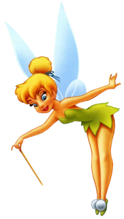
Using the original design and not the new one from the "Disney Fairies" or whatever they are, something about her new face bothers me to no end.
I'm not exactly sure about this. Tinkerbell really should have that horribly tiny mini dress, but I already used a design like that for Tiana. So I kind of had to think of something else. It is kind of cute, but I wonder if the character is recognisable? Also, I don't think the design is too pokemon-like, but trying to add random lines or pokeball patterns just made it worse. Especially when the original outfit is so simple, it didn't give me too much material to work with.
I like the poofy things on her shoes, I wish I could have used them a bit more creatively. I ended up putting one to her hair too... The other hair thing is supposed to represent her wings.
It was slightly annoying how the colour of her wings was inconsistent in the pictures I could find. In the end I just went with blue, but I don't think it was the best choice for the upper part of her shirt.
|
|
Esmeralda, from the Hunchback of Notre Dame
|

|
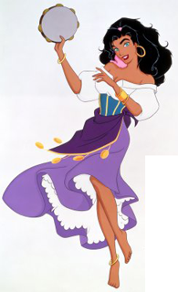
The theme of the movie is one of the best musical numbers Disney has ever made. Also, I remember being very... confused when I started to watch the movie with the "it's a Disney film, it's going to be all cutesy and childish" mentality, and then comes Frollo's "Hellfire". Kind of didn't see that coming (it was an awesome piece too).
The design doesn't please me at all. The original design had so much potential for a fun and creative design, but mine doesn't work the way I want. The problem is that Esmeralda's outfit has so many elements (bandanna, earring, poofy sleeves, turquise/yellow... shirt part, the cloth on her hips, the yellow things hanging from it, jewelry on her wrists and ankles), and tons of colours (pink, white, yellow, turquoise, purple, dark purple). And I just had to try to stuff them all into one design...
The skirt doesn't really work either, the cloth thing could have been used in a more creative way. Originally the skirt was light purple and the dark purple thing was a bandanna wrapped around her waist similar to the original, but since I have already used the "bandanna/cloth around the waist" four times I thought I should think of something else. At least it's different from the original.
My design was actually even busier before I realised I should try to simplify it as much as possible; the shoes and wristbands had more lines and the bandanna had a pokeball pattern.
|
|
Megara, from Hercules
|
|
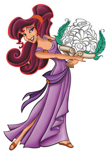
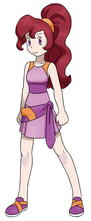
This turned out better than I expected from the sketch. I think that the biggest problem here is that the pose makes her look too... masculine(?). Especially when you consider how feminine the original character design is. But the colourscheme saves a lot.
The skirt was difficult. I would have wanted to use something similar to Leaf's, but I didn't want to copy her design just like that so I had to think of a cheap alternative.
I like how the shoes turned out. This is actually one of the four cases where I had the "hey! I have a fun idea on what to do with the shoes!" feeling, everything else has just been drawing random shapes to the shoes since the pokemon shoes never make much sense (the other shoes were Snow White, Pocahontas and Tinkerbell. But Snow White and Tinkerbell shouldn't count since I just copied the original design...).
|
|
Jane Porter, from Tarzan
|
|
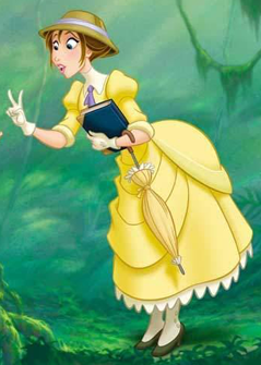
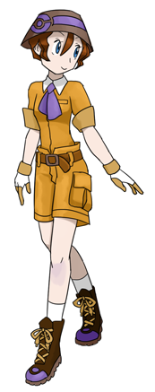
I still don't know what I was thinking with this. I mean, she had such a nice skirt with a distinct design that could easily have been simplified to the pokemon world, and I give her pants? It had something to do with thinking that it'd be nice for someone who goes into a jungle, but still... Besides, it looks way too much like Bugsy's outfit.
Aside from that I like how this turned out. The colours turned out calm and peaceful, but that's just because I eyedropped them from a screen cap of the movie because I feared that it'd be difficult to recognise the character. Then there's the little problem that it doesn't exactly fit within my original criteria of "what a player character in pokemon games would look like", but maybe it's ok this time?
Shoes turned out pretty ugly. Should have used a darker shade for the laces, and probably gotten rid of the purple half-pokeball shape.
|
|
Lilo, from Lilo & Stitch
|
|
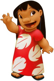
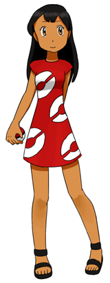
I wasn't sure what I should do with her. I considered drawing her as a little kid, but in the end I drew her in the same preteen body (or whatever it is). That's because a) it fits the lineup better that way, and b) I changed most of the other characters' ages too anyway, but in their case I mostly aged them down instead.
Overall I'm a bit pleased with the design. It's super simple and I picked the least creative idea ever, but it's not like the original was that detailed either. I guess I could have tried to do something with her shoes, but I've never really put much thought into the shoes department.
|
Back
|
