(new navigation system / layout under construction)
Dress ups / Drawings / Manga stuff / Reviews / Other / About / History / Links out / Guest Book


Pokemon Princesses 5

(October 19, 2012)


Tiger Lily, from Peter Pan
tigerLily tigerLily

I can remember very little of Peter Pan, but I guess it did have this native American princess in it. Do you spell her name with one or two L's?

This... could have been better. The design might work, but the colours don't. The pink and purple just don't go with the rest of the colours, or at least in that large areas. Originally the whole jacket was pink but that was even more horrible. Or even more originally it was the same yellow as the dress, but that made it look too much like a long-sleeved dress instead of a dress and jacket.

I think there could have been a more exciting way to use the poncho, but I guess a huge hoodie will do. Shame you can't see it properly with the hairstyle, but if I had changed that it would have probably made it too difficult to recognise the character. And I could have tried to use the tassels a bit better, but that'll do.

Dunno about the decision to make the head band thingy go under her hair instead of over it. Over did look pretty stupid for a pokemon trainer though... I was lucky that pokemon has pointed bandanna... knots like that (like May's) so imitating the feather was pretty easy.


Melody, from the Little Mermaid 2 -Return to the Sea-
melody melody

Horribly boring movie but at least it's over now. And I didn't like the character much so I didn't bother putting much effort on the design either. Originally I thought that the sequel princesses (her and the emperor's daughters from Mulan 2) would have no place in my awesome princess project, but the collector in me tells me to draw them so here she is.

Both her pyjama and the mermaid outfit were pretty boring so I ended up using both (pyjama pants + mermaid colours). Overall I didn't have much idea what I was doing so my version doesn't have much of a theme, but I guess it could be worse. I actually like the pants, I don't think I gave anyone pants with a waist like that.

Dissatisfied with the sandals. Sure the original designs didn't have much detail, but I'm sure I could still have created something better than THAT if I tried... Also, what the heck is the bandanna on her ankle? There is a canon character with an ankle... thing I thought it'd be ok.


Nancy Tremaine, from Enchanted
nancy nancy

It took a while for me to realise that in fact Giselle never married the prince, and even longer to get that NANCY did. But here she is! Even if her only animated dress was a relatively boring all-white wedding gown that wasn't shown properly so it gave me very little to work with, so I'm not sure if anyone can recognise the character without reading the description. Oh well.

It was very lucky that she had a golden (?) tiara thingie so I got at least one other colour, and I consider black a fair colour to add if there's not enough in the original design. But on top of the problem with lack of the colours the original design had so little to offer that I had to use whatever leftover details I could rip out of it. So since I didn't have a good idea where I was going with the design it turned out to be just a compilation of random ideas. I don't think I should even have used such a girly design for a modern working woman like her, but she does wear that poofy wedding dress at the end so...

One of the few details the original design had was the frill, but that wasn't too useful for a pokemon design I was trying to keep from getting too girly. But I didn't have much of a choice so I had to do something with them, and the putting them on the pockets is and attempt at Hilda's ripped pants. Which have nothing to do with this, what was I thinking? Also, she had a necklace so my design has a generic neclace and the boots have random pearl thing strings (and the tiara shape as pattern). And then there was the veil, but I found it impossible to implement without getting too girly so I had to leave it out.

It's a shame though that I didn't realise that she should have some kind of... what are the communication things in the games anyway? Xtransceiver? to represent the mobile phone. Damn, that would have been a good idea! But I'm not going to redraw the pose just for that...

(that is a hairband, not a bandanna)


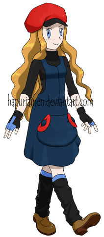
Anna, from Frozen
anna anna

Her movie interests me a lot; I used to watch a Russian (?) Snow Queen animation when I was a kid, and it was one of my favourites so I'm very eager to see what Disney does with the subject.

The only reference picture I could find seems mostly just a concept art so she might look different in the finished movie, which might mean that I'd have to redraw her (unless I end up hating the character). Or I could also find a picture of her in a white princess dress, but that was even more messy and impossible for me to use for a project like this, so I depending on how much I like the character I may have to pokemonify the white dress as well.

Her outfit had a lot of details, but I still wasn't exactly sure what to do with it. The winter setting hinted towards a warm outfit, which was less common for this project when almost everyone has summer clothes. I still didn't want to go for a full winter coat, which now that I think of it might still have been a better choice. The Platinum designs for the player characters do have a warm winter clothes after all (or of course the girl still has to go around in a miniskirt for fanservice).

I like how the hat turned out. It's not exactly what I had in mind, but it's still a lot better than just copying the one the original design has (first idea) or giving her the same hat I gave for Aurora (second idea). And this time I could even justify the leg warmers I really wanted to use for any character in PokePrincesses 4 (but luckily didn't, they didn't look good on any of them). The pocket could work a bit better and I might have been able to stuff a pokeball design somewhere but I still like how the buttons turned out.

The original outfit had purple as well, but it made my version look too messy so I recoloured the purple bits either black or blue. In the end I really like the colourscheme, but to be fair it's pretty easy to stand out positively with a calm colourscheme to me in this project when everything else has bright colours.

At first my design had a lot more detail, such as a bow on her back, more lines on the hat and dress, stripes on the leg warmers and more red on the pocket, but I'm really glad I had enough sense in me to tone it down a bit. Overall I'm pretty pleased with the outcome.

Does she really have freckles?


Back