And here would be the last Disney princesses... if someone hadn't mentioned that the princess(es?) from Super Mario games appear in a Disney movie. What am I going to do about that?
|
Mei, from Mulan 2
|
|

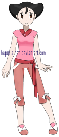
Uh-oh, Mulan 2... Since Mulan is my favourite movie the sequel that derails the characters to one-dimensional buffoons, ignores the culture (Emperor's daughter's face an arranged political marriage in ancient China! That is so horrible and represses women! In ancient China!) and has a bad and predictable plot isn't exactly what I would have wanted to see, but it was necessary to complete the princess lineup and at least it's over now.
In my opinion she got the most boring design out of the three sisters and I didn't really have any idea what to do with her outfit. The only thing I could think of was the collar, but the rest was just putting random ribbons to otherwise extremely plain clothes.
|
|
Ting-Ting, from Mulan 2
|

|

I think she turned out the worst out of the Mulan 2 princesses. While Mei is pretty boring at least there is some kind of common theme going on with the ribbons and the collar was a nice idea, but practically the only unique thing about Ting-Ting is the ribbon on her skirt. The jacket is as plain as it could possibly be.
I think I noticed that she had thicker eyebrows than the other two. Would this be the first time I gave a female character thick eyebrows, usually I use that to indicate 'this character is male'? ...nope, Toph seems to already have gotten thicker than average eyebrows already.
In the end her design turned out too sporty as well; wasn't she the most 'proper lady' of the sisters? I notice I can feel happy about the fact that despite having seen the movie only a few weeks ago it has succesfully already started disappearing from my memory...
|
|
Su, from Mulan 2
|
|
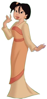
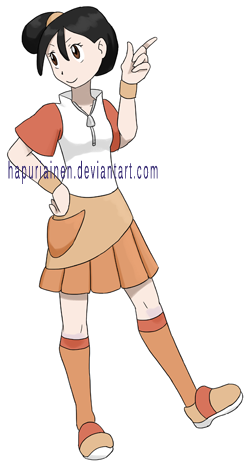
I consider this to be the best design of the three Mulan 2 princesses. It's the only one where I actually had some active ideas what to do with the design while the other two were just throwing random thoughts together and hoping it'd work out somehow. Plus she's the only one whose pose I bothered to think a bit more than the standard standing one.
Being the best of the three Mulan 2 princesses doesn't mean that she'd be all that good though considering the competition. I guess the skirt turned out pretty fun with the asymmetrical hem.
|
|
Sofia, from Sofia the First
|
|
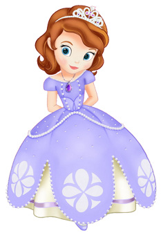
Originally I had no interest in her, but since I dug up even sequel Disney princesses I had to include her as well. Based on the trailer I can only say that based on that she was exactly what I expected to be: A cute, happy, kind, curious, a bit klutzy (hee-hee!) etc perfect little heroine in a wish fulfillment story for the young audience, i.e. very boring. But maybe I should stop about this now (or actually see the movie first before starting hating on her...)
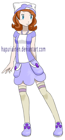
In the end I'm happy I decided to include her, since I like how she turned out and ended up being my favourite of this bunch. Her outfit had a lot of detail to choose from; the tiara and its shape, the necklace, the pattern on the shirt part, the pearl strings (?) on her waist, the shape and pattern of the hem, and the stripe on the underskirt. Naturally at first I tried to include everything I could get, and in the end I had to spend quite a while removing unnecessary detail. Erasing fun detail which was difficult to come up with is always sad, but an overcrowded design would be even more so.
The hat is pretty weird and doesn't have anything to do with the character but I still like it a lot. The heart shaped pattern could have turned out a bit better though, the hat should have been a bit larger. The skirt too could have turned out better; the original had a nice idea with the shape and two overlapping hems but I couldn't use the pattern as well as I wanted. And the stripe from the underskirt went to the socks. The shoes turned out pretty crazy and look pretty random even after I removed a lot of detail from them, but even if I don't think much of the parts of the outfit alone I still like how the big picture looks.
I really liked her pose from the draft, but unfortunately the finished version didn't turn out as cute. Colours unfortunately didn't turn out as well as I had hoped, she had surprisingly little relevant colours to choose from.
|
|
Amber, from Sofia the First
|
|
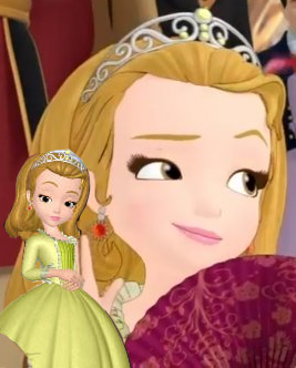
When Sofia suffered from having too many fun details to choose Amber had the opposite problem in that her dress was extremely plain. Did the designers run out of money after creating Sofia's outfit and the side characters had to settle with simple dresses? Or does it hurt the self-esteem of the little girls in the audience if the competing princess doesn't have a clearly less detailed than the self-insert main character? Why can't the dresses be of darker and less saturated shades anyway, that would look a lot better to me. And why am I asking this stuff about a show whose target audience consists of little girls under the age of ten or something like that?
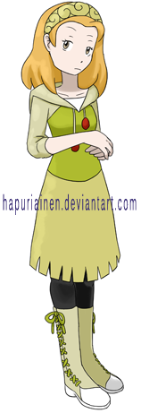
Okay, so I didn't know much what to do with her, especially when I didn't have a proper reference so if she has some fun detail on her hem I have unfortunately missed that (and the fringe I gave her doesn't really have anything to do with the character). Plus she seems to be a character who'd wear very fine and feminine clothes so I think my version ended up too plain and sporty. I guess the shoelaces could fit a character like that?
Practically the only thing I could get out of the reference excluding colour and hair style was the swirly things on the tiara. I tried to use them more, like as a pattern on the skirt, but that turned un-pokemon like pretty fast.
Surprisingly her colours turned out fairly well even when the reference practically only gives three shades of green that are very close to each other.
I tried to imitate the pose from the reference, hopefully that turned out well enough.
|
Back
|
