(new navigation system / layout under construction) | |
| Dress ups / Drawings / Manga stuff / Reviews / Other / About / History / Links out / Guest Book |
(new navigation system / layout under construction) | |
| Dress ups / Drawings / Manga stuff / Reviews / Other / About / History / Links out / Guest Book |
|
|
| Eilonwy, from the Black Cauldron | |
|
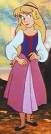
Last time I complained how boring her outfit turned out. But I don't hate it quite that much any more, and I don't care enough about the character to design a completely new one, so the old one got through almost intact. Besides, it's not like I thought the old version was particularly bad, it was just kind of boring and generic. The new slightly less static pose helps too. The only changes were the shoes and collar of the vest. |
|
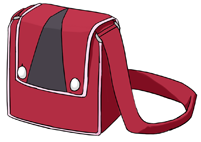
I had no idea what to do with her bag (or actually, I had no ideas for any of the bags in this set), so I just used a model I hadn't used already and that's that. Now that I think of it, I'm not sure if using the triangular shape from her skirt that much was a good idea (since I added it to the shoes as well). Maybe either the shoes or the bag could have used the red stripe from the shirt? |
| Kida, from Atlantis the Lost Empire | |
|

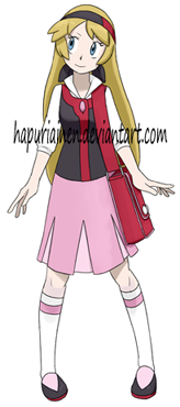
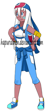
The old design had to go, it was just too scanty for the supposed ten-year-old protagonist of the pokemon games and I never liked it in the first place, but I'm not all that sure if the new version is any better... (other than being less revealing) I like the new colours, but it's just way too busy and I didn't have any particular ideas so it ended up as a mish-mash of random stuff. Not liking how she has a shirt tied around her waist since it's the exact same thing I did for Cinderella, and both even have a blue colourscheme. But I really didn't know what else to do with the wrapped skirt thing she had (since drawing bandannas tied around the waist always feels stupid), and this was such an obvious solution that I had to go for it. Speaking of bandannas, I think I over-use them anyway. Don't I have like ten of them, just tied in different ways, already in the PokePrincess project? The only thing I like is the shirt, it's a somewhat new desing in the PokePrincess project (or one of Ariel's sisters has kind of a similar one, but nobody cares about them). It went through many colour options and I'd still prefer it to be blue, but that absolutely refused to work in any way. I do think one reason for the general messiness is the backpack since it adds two new colours and a lot of lines to the middle of the picture. Not that it was a good excuse, the designs are supposed to work with and without the bags. |
|
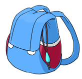
Nothing to see here either. In the last design I complained for not using the important crystal anywhere in the design. I didn't really get to use it this time either, the only place where I could manage to stuff it was the backpack. The female player character doesn't have a backpack that often (is Crystal the only one?), but I still want to have some variation and not give everyone bags. In these four I knew I'd want to give Elsa a bag and not a backpack, but the other three have long hair which kind of doesn't go well with a backpack in my opinion. But since Elsa was out I thought Kida would be the most likely to have one. |
| Giselle, from Enchanted | |
|

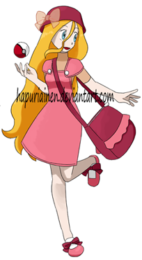
Even if the character may not be that recognisable any more, I like the new Giselle. The previous one just didn't look like someone who would be going to walk through forests and mountains to catch Pokemon. Neither does the Charlotte design for that matter, but she's special. The old hat was kind of random and stupid and I like the new one a lot more. Perhaps it could be lighter? Do the dark red hat and bag make the design too dark and dull? Overall the colourscheme is a lot darker than the old one. I like it, but I'm not sure if it's the correct one for the character (it was difficult trying to eyedrop the correct shade from the reference. I could have tried to search for a good screen shot of the movie, but...). I wish I would have managed to use the long red ribbon somehow, but I couldn't think of a way that'd look super impractical for outdoor use. Somehow yet again Giselle is the only one to get a somewhat interesting pose. Is it possible for the hair and dress sway to one direction while the bag sways to the other? |
|
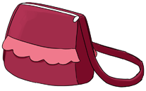
Giselle's bag is the only one I can say I like even a little. It's super simple, but I think it somehow works; It's not like the real pokemon bags are that complicated either. |
| Elsa, from Frozen | |
|
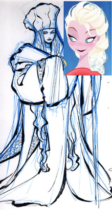
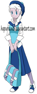
Since I hear Frozen will give two new characters to the Disney Princess lineup Elsa had to be included in the better PokePrincess series (those who get the bag). Or actually I haven't seen anywhere any confirmation that Elsa will be the other princess so with just that information the two new princesses could refer to Anna and some unrevealed surprise princess, but I don't think that's very likely. Besides, if the movie has Elsa's coronation it should mean that unless it's the first scene in the movie she should spend some time as a princess before it in the movie, warranting her a place in the PokePrincess series anyway. Reference was a pain. First there was this concept art. Then a movie poster with a drastically different design appeared. Then someone said it's a fake. Then someone said it's a fake based on her real design. Then someone said it's a fake based on her real but old design. Then an official art of her head appears, looking like the fake poster. Then someone says it's a possible concept. And during all this people draw fanart based on what information they can get, and other people spread it around without any credit or reference, making it look like they were the real finished design. Yarrrr! So at this point I don't really care about what her real desing is; it should get to Disney Wikia or the Tumblr tags I track fairly soon. If it's very much different from my Pokemon version I can just draw a new one, Anna has a Pokemon outfit based on a concept design as well. Since I wasn't sure if the design in the fake movie poster would be the one I want to use I ended up using the concept for clothes, fake poster for (most of the) colours and the official headshot for hair. Not that either possible outfit gave much to work with... Overall this turned out a lot better than I expected. I like the blue/white colourscheme a lot, and even if the outfit is probably a bit boring I think it somehow works. Now that I think of it, it's very similar to Bianca's but only in different colours (long skirt, vest, tights, similar hat). But this came pretty naturally when I tried to think of something suitable for a bit more mature look. The hair/hat were kind of a problem. I really wanted to draw a hat like that, but I don't know if it works with the hair. Also, I probably should have used the hat in the reference since she for once has one. |
|
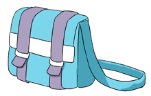
...Nothing to see here either. This is probably the laziest bag in the series, now I'm actually hoping that she'll get a very different design so I can draw her a new one. Orrrr I could draw a new one just now, but that'd mean altering the character picture as well, and all that mess... |