(new navigation system / layout under construction) | |
| Dress ups / Drawings / Manga stuff / Reviews / Other / About / History / Links out / Guest Book |
(new navigation system / layout under construction) | |
| Dress ups / Drawings / Manga stuff / Reviews / Other / About / History / Links out / Guest Book |
|
|
| Snow White, from Snow White and the Seven Dwarfs | |

|
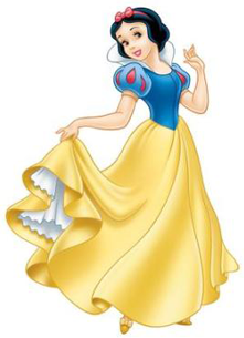
I have a feeling that I had some really great and innovative idea for the jacket, but apparently that disappeared somewhere and never made it to the paper. Now if you remove the Pokeball apple it's just a boring blue jacket. But I like the apple! It's the same brand as Snow White's bag in Pokemon Princesses 10. Snow White wears the same pants as the original Gold. At first they were a bit different, but when I noticed the similarity I just thought that they can shop in the same store. Not sure how well this hairstyle is suited for either a male character or a Snow White design, but I still like it and any other attempts ended up looking a lot sillier. |
| Cinderella, from Cinderella | |
|

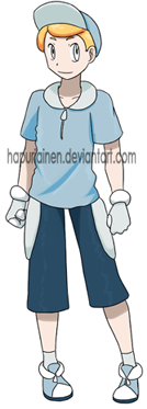
This one didn't turn out too well. I wouldn't say it's awful or anything, there's just nothing interesting about it. What I can get out of Cinderella's dress is the poofy sleeves and... that thing on her waist, but it's incredibly difficult for me to think of a way to incorporate that to a male design. The random dark blue from Pokeprincesses 8 makes its return here, it has nothing to do with the reference but I just can't make a design out of just two blues that are very close to each other (and there's white too I guess). Hair was another problem. I couldn't think of anything to do about that updo that wasn't super girly, not even about the fringe, so I settled for a hat that covers it all. |
| Aurora (Briar Rose), from the Sleeping Beauty | |
|
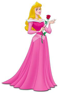
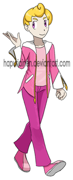
I was expecting this one to cause me a lot of trouble. I mean, it's pink, you can't get anywhere from that. Or of course I could use the blue dress or the forest dress, but the original point was to use the same dresses I use as the "default" dresses for the girl versions. But anyway, I thought it'd be incredibly difficult to make a male design out of something that is nothing else but pink. Buuuut in the end I just went with "so why couldn't it be pink? There's no rule that says that guys can't wear pink!" and didn't even try to incorporate black to the design or make it mostly white with just pink accents. As for the design itself, I'm pretty pleased with how it turned out. Something about the jacket just works for me, and aside from the fact that I don't like the pink by default, the colourscheme turned out pretty well too. Pose on the other hand is somewhat awkward and the face is off, but I guess that an attempt at something more interesting is better than a boring static standing pose #142? This time with the correct eye colour. Apparently all my previous Auroras have blue eyes... |
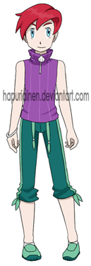
| Ariel, from the Little Mermaid | |
|
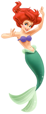
This was the first thing I drew for this project, and overall I'm pretty happy with how it turned out. Since Ariel's outfit is nothing but a seashell bra it was a bit difficult to work with it, since no male player character in pokemon shows much skin. I think this is the most I can do without making the design overly goofy. It is kind of surprising how much stuff you can get out of something as (seemingly) bland design as Ariel's. Counting Ariel's sisters and daugther who all have almost identical mermaid "outfit", I've now drawn ten different designs out of it, and I consider most of them be on the better end of my designs. Pose turned out pretty bland though. Or "incredibly" bland to be more precise, I don't think I could draw something more boring if I tried... Still no idea what is going on with the hair. Does he have otherwise short hair but at the front it's incredibly long, and then he uses superglue to get it into a weird arch like that? |
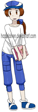
| Belle, from Beauty and the Beast | |
|
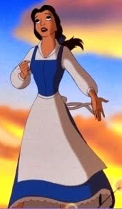
Belle continues to appear in the blue dress instead of the ugly yellow thing. Overall this turned out a lot better than I expected it would. Originally I was supposed to give him long pants and a shirt blouse/vest combo, but I thought that'd make him look too much like a prissy schoolboy in some expensive private school rather than a kid going on an adventure. So I ended up giving him the same shirt Ame wears in Wolf Children which I watched recently and some baggy pants. I now notice that quite many of the boys I drew got capri length baggy pants... I don't think boys wear them that much? The male player character in HeartGold/SoulSilver wears them, that's where I got the idea in the first place, but I think it's gotten a bit out of hand. But really, there's not much I can do when skirts, dresses and very short pants are more or less off-limits if I'm trying to make a design resembling the male player characters in Pokemon. Not sure what's going on with the pose. This one was drawn straight from the draft from the sketchbook instead of making a finished drawing on a fine clean paper, because I thought the pose was cute and I was sure I wouldn't be able to replicate it. The book he's holding is "Beating Whitney" from the Nacrene Gym picture. I would have liked to use "Cooking Pokemon" instead, but that was kind of out considering the movie never mentions Belle reading anything but fairy tales and stuff like that. Or well, actually the Beating Whitney book was supposed to be a guide to beating her, but I guess it could be a story as well. |
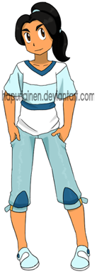
| Jasmine, from Aladdin | |
|
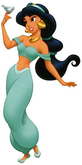
The face turned out pretty wonky but otherwise I'm more or less happy with this. What is essentially a bikini top and poofy pants isn't exactly the best source material for making a male design, but the shirt stripes designed themselves and the earrings made a nice detail for the pants. As for the shoes I kind of feel like it was a fun idea wasted in a poor place. Or at least I should have designed the pose to show the side a bit better. |
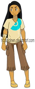
| Pocahontas, from Pocahontas | |
|
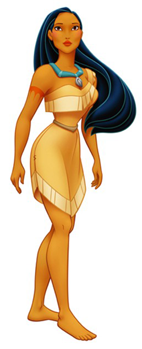
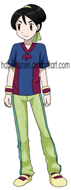
I was excepting this one to bomb, and while I still can't say I like it, it's still a lot better than what I feared. Pocahontas' design should have a lot to work with (that fringe thing, one sleeved dress, tattoo, necklace), but somehow I always have problems with it. And now a lot of ideas were unusable because they felt too girly. And the shirt kept resembling something that'd fit an Asian themed character instead, but I sort of like how it turned out in the end. I like how the pose turned out here. The sketch had him frowning a lot more, which looked better in my eyes, but I thought it'd be weird for only Pocahontas to look unhappy so I had to change it to a somewhat smile. I also like how the character manages to look like a boy (at least to me) despite having long flowy hair. I think I could have done more with the tattoo. Arm warmer with the same pattern on just one hand is an okay idea I guess, but I totally forgot I got a red colour out of it. Could've put some red to the shoes at least. |
| Mulan, from Mulan | |
|
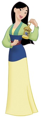
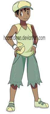
Oh, Mulan, you're as impossible to design as always. It really sucks because I'd like to do my favourite character far more justice, but I just can't get anything out of the original design. The shirt collar idea in PokePrincesses 8 was good, but that's about it, and it's not a very good sign if I've created a design from a character four times and only had one good idea. But that's all there is! It's just boring straight lines. Yarr! Anyway, Mulan here is wearing tracksuit pants since he's training. Nothing else to see here, moving on. |
| Tiana, from Princess and the Frog | |
|
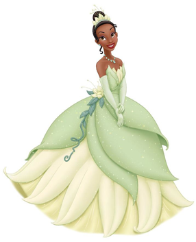
Tiana's another one of the cases where I feel like the reference should give material to a lot more, but I just don't know what to do with it. There's the huge bell-shaped skirt that has two different leaves, dew drop necklace, a flower with twirly vines, a leaf crown, and the way the leaves are arranged at the top part... I don't know. I'd really like to do more with the twirly vines in any Tiana designs, but I don't remember seeing anything like that in a Pokemon human design so so far I've had to leave them out. I do like the idea of the placement of the pokeball pattern on the shirt; it's sort of weird how I've never thought about something as simple as that before even if I've already done two designs out of this dress before. I tried to make the pokeball a bit more interesting by having it resemble a frog, but that ended up looking more like a bear so I had to scap that idea. Now that I'm writing this I thought I could have tried a leaf instead, but it's too late now to change that. But I'll keep that in mind for a next Tiana desing, I'm sure I'll come back to Disney Princesses' main dresses many times in the future. |
| Rapunzel, from Tangled | |
|
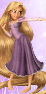
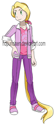
Anna and Rapunzel have their poses swapped from the drafts. Which... has nothing to do with anything really. This one is maybe a bit plain, but it turned out a lot better than I expected. Or now that I think of it, if he zips the jacket there is absolutely nothing interesting in the design. So he'd better keep it open then. The hair ended up giving me a lot less trouble than I thought it would. I suck at drawing males, and especially younger boys I draw tend to look pretty girly anyway. In the pokemon design project where their proportions are strictly defined by the exact same guidelines I drew for the first pokeprincess picture pretty much the only differences between boys and girls is the waist/boobs area and the fact that girls have eyelashes while boys have thicker eyebrows. And with long hair usually being more feminine I was sure that it'd be impossible for me to draw the character whose most defining thing is the long hair (and who has one of the girliest colourschemes possible) not looking like a girl. Buuut I dunno, the result looks like a dude to me at least. Maybe the ponytail is too thin, but whatever. That is supposed to be a pokeballified version of the Rapunzel's kingdom sun logo on the shirt. |
| Merida, from Brave | |
|
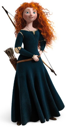
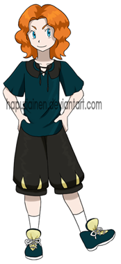
Merida might be one of my favourites of this bunch, but I don't know how much of that comes from the fact that the colourscheme is the least bwight and colourfuww which is an automatic plus in my book. Aside from that, there's not really much to talk about, except the fact that almost nothing other than the colours comes from the source design. But what I was supposed to do with it anyway?! It's just a plain green dress with almost no detail. Also, I really like drawing this haircut. I often give it to the random girls I draw in my sketchbooks during lectures, but now I got the chance to use it in an actual drawing. |
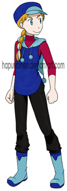
| Anna, from Frozen | |
|
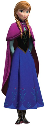
Anna turned out decent but I had higher hopes for it. I think it's the colours that didn't work the way I was hoping when watching just the black&white sketch. About the only interesting idea I had for this was the hood having a little pom-pom, but with this angle I wasn't able to pull that off as well as I had wanted. At least you can see the pom-pom, but the hood itself doesn't look like a hood at all. Drawing a braid on a boy feels a bit odd, but if Edward Elric can have one I can draw it too. |
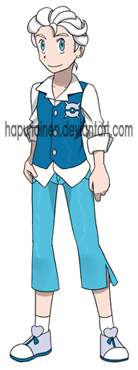
| Elsa, from Frozen | |
|
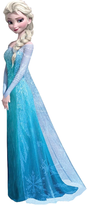
Oh Elsa. I've seen tons of incredibly cool "male Elsa" designs on the internet, but they're always going for the "Ice King in Fantasyland" aspect, which doesn't exactly help me if I'm trying to draw a pokemon-style outfit for a kid. I probably have more rejected male Elsa designs than I have rejected designs for all the other 25 characters in this project put together. Whatever I did it always ended up as this "prim and proper" design (if it ended up as anything decent at all), which wouldn't really be a problem because it's not like I've paid too much attention to the characters' personalities in the gender-bender design project anyway, but in Elsa's case the whole point of the new dress was going AWAY from being the "perfect girl". There's also the problem that almost everything I can get from Elsa's Snow Queen dress is somehow super feminine in my eyes. See-through fabric? Glitter? Slit in the hem? That made it even more difficult for me to think of an adventurous boy design. In the end I ditched the long pants and the result turned out a lot more what I wanted. And then I threw in the collar shirt + vest combo I tried to use for Belle, and in the end I'm pretty satisfied. With the sporty shoes it looks like something you could wear on a trip outdoors rather than at a party, but it's still a bit more formal than plenty of the other designs here. |