(new navigation system / layout under construction) | |
| Dress ups / Drawings / Manga stuff / Reviews / Other / About / History / Links out / Guest Book |
| (new navigation system / layout under construction) | |
| Dress ups / Drawings / Manga stuff / Reviews / Other / About / History / Links out / Guest Book |
|
|
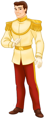
| the Prince, from Snow White and the Seven Dwarfs | |
|
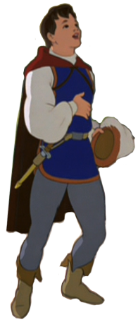
Starting with... uh, prince Nameless from Snow White. Really, they couldn't be bothered to think of a name for this guy, seriously? I see "Florian" or "Ferdinand" floating around, but I haven't seen anything confirmed. Overall when I look at this I think "wasted potential", because I think that the source design had material for a lot more interesting design, but at the same time it'd kind of feel like a waste to use a good design on such an irrelevant character as this. Apart from that I still find this a fairly okay design even if the hat would desperately have needed more work. At least I like the poofy sleeves? |
| Prince Charming, from Cinderella | |
|
I thought of this skirt design months ago, but I've never found a good place to use it. Wasting it on Prince Boring might not be the best idea, but if I won't draw it now I'll probably totally forget about it. But really, there wasn't that much I could get out of this. I guess the socks are nice? The super long hair is a bit random. I just wanted to draw a hairstyle like that, and Charming's real hair had shapes resembling it. Plus the other option was to keep the hair as it is, but I already gave very short hair to Phillip and I didn't want two same hairstyles right next to each other. |
| Phillip, from the Sleeping Beauty | |
|
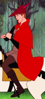
This yet again one of my favourites possibly for the fact that the colourscheme is good. Red + black usually looks good by default, and muted browns and greys really help as well. I do find the design pretty creative too though so I believe it'd still be at the higher end of my ranking even if it had less good colours. I saw this really cool hat on a bus and I wanted to use it somewhere. Unfortunately I couldn't remember clearly enough what it looked like to be able to draw it properly, so this isn't quite what I wanted. Also I had no idea what the hat was called so googling was no use. I have this problem with the hair that the default option is more or less "long hair for girls, short hair for boys". So more often than not when drawing male versions of female characters I tend to grow their hair three times longer. But here's one exception where I managed to keep the hair short. Pose is a bit dumb but I still like it. At least it has more personality than most of the other stuff I draw for these design pictures, even if it didn't have much to do with the character's personality. |
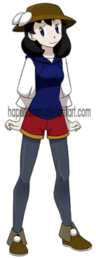
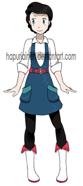
| Eric, from the Little Mermaid | |
|
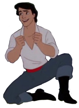
This was the second design I drew for this project after Ariel. At first it was just randomly drawing genderswapped poketrainer Ariel and Eric during a lecture when I was bored (they were the only ones who had simple enough designs to remember without reference), but somehow it evolved into a larger project encompassing all the Disney Princesses and their princes. Considering how incredibly boring Prince GenEric's clothes in the movie are I think this turned out relatively okay. It's still fairly generic though so there's not much to say about the result. She has braided hair tied to a loop in the back of her head, but unfortunately you can't see it because I still use too dark grey when colouring stuff that's supposed to be/represent black. |
| Beast, from Beauty and the Beast | |
|
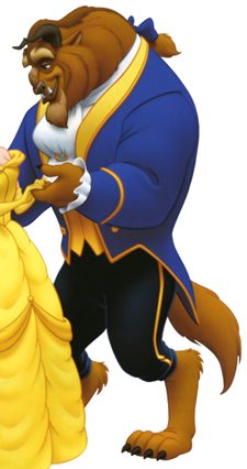
I drew this after John Smith and failed to notice that they have almost exactly the same pose... Oh well. Not my favourite, but I guess it could have been a lot worse. Or it was a lot worse; Female Beast required quite a few scrapped ideas and I tried to force one particular dress in the design multiple times before I gave up, and this one is a giant leap forward from that. Now that I think of it, I don't use this kind of short jacket that much? At least it feels rare. Initially I went for twintails hairstyle to symbolise the horns but that looked pretty silly. Then I tried the hat the Bratz doll Jade had in the first edition doll (pic here) (okay I had one of these and I don't want to talk about it. not this one though, mine had a cabbie hat), but that wouldn't work either, so I toned it down to the kitty ear hat Izumi had in Digimon Frontier. Even that didn't turn out as well as I had hoped but at least it's better than the previous versions. And I'll use that Jade hat on someone for sure once I find a good personality for it! (that is a ribbon in her ponytail by the way, I didn't realise it looks pretty dumb with the sketchy lines that get hidden by her body erased) Initially I thought that the paw prints on the bottom of the shoes was a brilliant idea, but then I realised Iris already did that first. I wish I hadn't remembered that... |
| Aladdin, from Aladdin | |
|
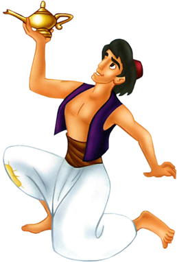
With this I am mostly okay but the colours of the top don't work as well as I had wanted. Maybe I should have made the red part of the shirt white? What I really wanted to do was to make the patch on the pants in some cute shape, like a heart or something, but that felt too girly. So now it's a relatively boring square shaped pocket instead, hopefully the asymmetry makes it a little less boring. The idea for the pants from the W.i.t.c.h. comic, where I remembered the character Will wearing pants like that for a party. Except they had the pants tied twice so there was a separate "poof" at the bottom. I thought they looked pretty silly, but that's what made them memorable. |
| John Smith, from Pocahontas | |
|
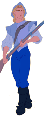
Reference picture was drawn by David Kawena. I don't like using fanart for the references, but in this case this one was so good that I mistook it for official character sheet at first, and it was leagues better than any official art I could find of him. Maybe it's the colours that go well together again, but I'm pretty happy with how this turned out. They create a peaceful and balanced impression rather than... the pretty random mess many of the others do. I was reading a book on history of Barbie (or watching the pictures actually), and there was this photo of the very first Skipper doll, who wore a sailor shirt where the collar was very deep. I became super inspired and tried to put a collar like that on a dress for many of the characters in this project, mostly Hans, but it never turned out too well. Then I noticed the pointy "sleeves" of Smith's... armour? and the sailor collar somehow morphed into overalls. I don't know how much sense it'd make in the real world, but I think it makes for a fun design that's different from the other dresses and overalls I've made so far (I think). I like the idea for the hat, but it could have used a bit more work. |
| Shang, from Mulan | |
|
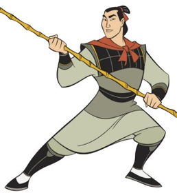
I'm rather pleased with Shang considering how I thought he'd end out stupendously boring thanks to the original design. But surprisingly I could get a lot of stuff out of the armour and now I'm actually thinking that I might have gone overboard with weird details... There used to be buttons on the wrap skirt but they made it look way more crowded, so now there's just one (hidden under the vest thing). Could have done something more interesting with the hair, I'm pretty sure I've already used this exact same hairstyle on Mulan like three times or something. |
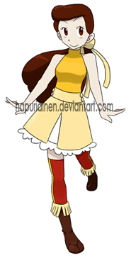
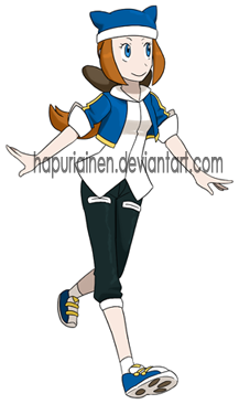
| Naveen, from Princess and the Frog | |
|
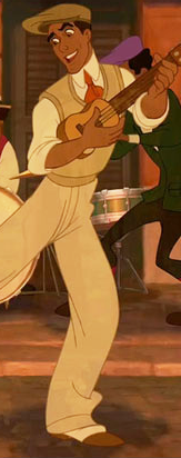
The problem with Naveen is that he kind of lacks an iconic outfit. I polled my dA visitors on what they consider the most memorable outfit of his, and this one won despite the lilypad outfit at the end being the only one to get promotional clipart. I agree that the lilypad outfit isn't what I think first when I think of Naveen, but this one is kind of bland so it's pretty difficult to get a design out of it. I find the end result mostly ok, but that might be because of the peaceful colours again. I like the idea of the... shirt? Dress? Whatever that is, but it really would have needed a belt. But I run into a problem that it looked almost exactly like what Yellow (from the Pokemon Special manga) wears, and adding a belt would have made it look even more identical. |
| Flynn Rider, from Tangled | |
|
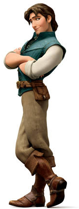
Ehhhh not really the best of the bunch. A lot of the designs were quite mini-skirt-y or had hotpants or something else very girly, so I wanted a tomboyish design to balance that out, but I feel that affected the quality of the design. It's far easier for me to draw girly clothes and male or tomboyish designs often feel somewhat forced. Also the fact that I was designing 13 male designs based on the Disney Princesses at the same time, which also ate its share of design ideas suitable for male clothes. As a result this one turned out pretty bland, and I don't think it resembles the character at all. |
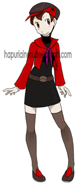
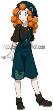
| Harris, Hubert or Hamish, from Brave | |
|
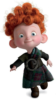
What is this brat doing here!? The idea that I'd draw female designs based on the princes of the Disney Princesses was quickly met with the problem that Merida doesn't have a prince. She has the three suitors, but since she doesn't end up with any of them and none of them is really more important than the other two to warrant a spot in this over them I settled with her brothers. They're princes from the movie and I get three birds with one stone since they all look the same. Considering how at first I had no idea what to do with the design I like this quite a lot. At least I don't remember drawing overalls like that before so it's at least somewhat original, and the Teddiursa head keeps it from being copletely plain and forgettable. It also helps that the colours are pleasing to the eye by default. Hair could be a lot better. It was difficult to get it not look like a grandma's perm, and the colouring job didn't turn out too well. The first draft looked more natural, but unfortunately none of that got into the finished picture. Also, I have absolutely no idea what the... scarf thing on her head is supposed to work. |
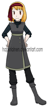
| Kristoff, from Frozen | |
|
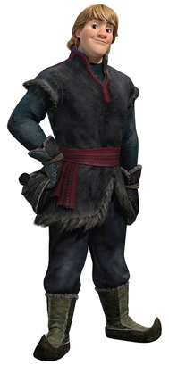
This one was quite a problem. Initially the pants and shirt were skin-tight, and I liked that design a lot, but there was this problem that Kristoff is probably the least likely to wear something clean-cut or prim of the Disney princes. And the female version looked far too cutesy and feminine with what looked like tights or leggins and a dress. But I liked the dress idea so much that I didn't want to scrap it, so I just made the shirt and pants baggier. Aside from the fact that it's a bit too much to the left I like the head scarf a lot. Even if it makes me think of Haruhi Suzumiya. This is yet another of the designs that benefits from the dull colourscheme. I think I might just as well say that regardless of how the actual design of the outfit turns out, I end up liking the outfits with a dull colourscheme and disliking the ones that are bright and colourful. Which is a bit depressing when you think about it since that means all the effort put into the designs is totally wasted... |
| Hans, from Frozen | |
|
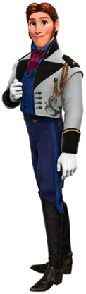
Aaaand here is another dude besides Merida's brother(s) that doesn't really belong with the rest of the characters. But can't help it, I want an even number of ladies and gentlemen, so Elsa has to settle with him. Hans turned out quite a mess and would have needed more work. I already had a finished Hans design at least twice waiting to be drawn in Photoshop before I decided that it was so bad that I'd had to start all over. This one is a bit better than the scrapped ideas, but... not by much frankly. The only idea I had was the high pants, the rest is pretty much random stuff thrown at it and hoping something would work. A scarf + short sleeves seems incredibly dumb to me, but the player characters and the rival in Diamond and Pearl did it first so I'm good (I think). |