(new navigation system / layout under construction) | |
| Dress ups / Drawings / Manga stuff / Reviews / Other / About / History / Links out / Guest Book |
(new navigation system / layout under construction) | |
| Dress ups / Drawings / Manga stuff / Reviews / Other / About / History / Links out / Guest Book |
|
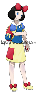
I have this feeling that I might need the Pokemon Princesses designs in my art later, so I thought I should redesign some of the most horrible ones. And they also kinda needed bags too. The bags serve another purpose as well: hopefully they now look a bit more like "Trainers" and people won't call them "Gym leaders" as much. |
| Snow White, from Snow White and the Seven Dwarfs | |
|
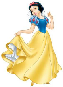
The old design was ok enough that I didn't see a need to do anything about it. Maybe it could be less exciting, but I don't think it'd be smart to start fixing something that's not broken. |
|
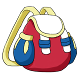
Her bag is about as little exciting as the outfit. The colours were a slight problem and I'm not sure if red was the right choice, but blue was out because I don't want a blue bag against a blue shirt, and yellow might have been boring. |
| Cinderella | |
|

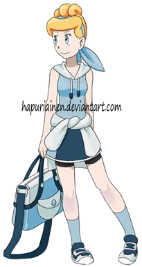
The old design was pretty bad and in my opinion merely toning down the bright colours towards to the white/grey dress she really had in the original movie improved it greatly. Again I had to kind of invent a third blue to get one darker colour, without it the design looked too much likea a pyjama to me. The old design had other problems besides the colours as well; the shirt was pretty random and the boyish pants made no sense for such a feminine character. So now she has a skirt and a top that hopefully is a bit better. She keeps the long-sleeved shirt tied to her hips though, I think it was a fun idea even if the art is still pretty much copied from Candice. Altered the hair colour as well, the old one was pretty horrible. Now it's closer to her hair in the original movie right? The hairstyle is as horrible as earlier though... But there's not much I could do with the hairstyle from the reference. Oh, wait, Mulan and Tiana use a different hairstyle for the Pokemon design instead of the one they have in the reference picture with the particular outfit. I guess I could have done something with it, her peasant hairstyles were much more tolerable. |
|
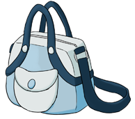
Cinderellas' bag turned out pretty unimpressive, and the only idea I had for it was the strap system. The colours don't work like I wanted, the light blues are too close to each other. |
| Aurora (Briar Rose), from the Sleeping Beauty | |
|
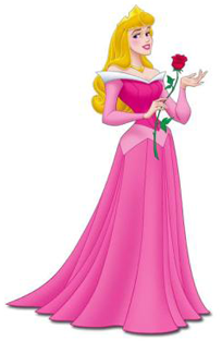
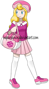
Since Aurora is my least favourite out of the Disney Princesses she got the short end of the stick when it came to designs last time. Now she got the redesign she desperately needed, and while I'm still not completely satisfied at least I consider it a major improvement. The old outfit was just random ideas that had nothing to do with each other thrown together but this one at least makes some sense. The shoes were pretty much the only thing allowed to stay from the old designs (they on the other hand turned out great, they were my favourite out of the old 8 designs). I hated the old hat but I'm not all that sure that the new one is much better...
|
|
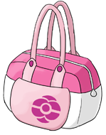
There's really nothing special about Aurora's bag, but I still think it kinda works. But I really like the pattern (that's supposed to be a combination of a pokeball and a stylised rose); I think it was a nice idea I managed to pull through surprisingly well considering how bad I'm at drawing roses. And it's simple enough to fit the pokemon world. |
| Ariel, from the Little Mermaid | |
|
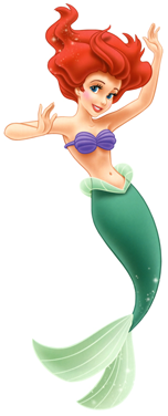
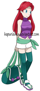
The original design for Ariel had trouble with the bandannas; it was stupid how she had one on both her waist and neck. So I threw the neck one away. I managed to paint myself into a corner with the colours. I had this grand vision - shirt:purple, bandanna:light green, top:purple, to imitate the reference. In the previous version this caused no problem since she didn't have socks, but this time I run out of colours for the pants. I could have left them dark green, but I really wanted to follow the reference and have [the largest part of] her lower body dark green. So when in the end I had no idea what to do with the pants I just left them white. But yeah, she ended up getting socks. When I originally designed her a year ago I was going for a beach look. But this time I was more strict about the whole "design it to look like the player character in the games" rule thing so I decided to give her a little less revealing wardrobe and change the sandals to shoes. Not that she could really go to an icy mountain or desert in that outfit, but then again it's not like the real player characters have that good clothes for such activities either. |
|
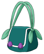
I like the idea for the bag even if it might not make sense in real life. The straps are supposed to be made of soft but sturdy cloth that is tied to the edges of the bag (but in reality it's sewn too so it doesn't only rely on the knot to hold). The colour problems continued to the bag as well. Maybe dark green wasn't the best choice, but I really wanted the straps to be light green (as the ribbons are supposed to symbolise the ...tip of her mermaid tail), purple was out of question (meh), and the original character design really has nothing to do with white. I assume a picture might look better if she was carrying the bag; it'd be around her hip level so all dark green wouldn't be stacked to the bottom of the image. The seashells from the old design's sandals moved to the bag. They still look a bit tacked on... |
| Belle, from the Beauty and the Beast | |
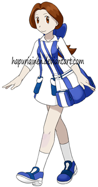
|
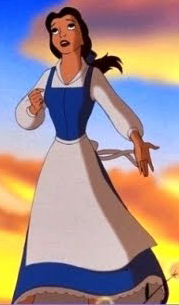
Belle was my favourite design from the old bunch and it still retains this position. Why must that be, I don't like the character at all... But because of that I didn't need to do anything for her design as I already found it nearing perfection. The old drawing of her is still superior. Why do I go backwards with my skills? |
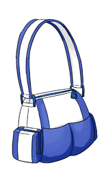
|
Like her outfit I really like how the bag turned out as well. I had a simple idea for it and it just kinda works. Maybe it's a bit silly how her outfit and bag are so blatantly similar, but whatever. |
| Jasmine, from Aladdin | |
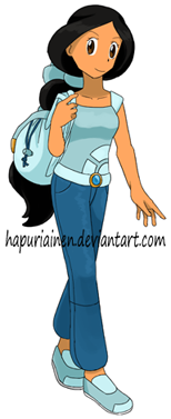
|
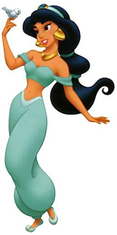
Jasmine's old design was almost ok, but I ended up covering her stomach because the previous version was a bit too revealing for the female player character after all (apparently Ariel gets a pass...) And the pants really had to be recoloured, no matter how much I look at the old version it still looks like a pyjama. But there really is a dark blue like that in the original reference, it's from the jewel on her headpiece! |
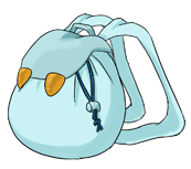
|
I'm not sure if this one would work in real life. Because Jasmine has such soft and poofy clothes I wanted to give her a soft and poofy bag as well, but while something like this would be nice and cute if you fill it with soft object I'm not all that sure it'd be comfortable if you put hard and angular ones in it instead. Maybe it has some kind of structure inside against your back or something... |
| Pocahontas | |
|
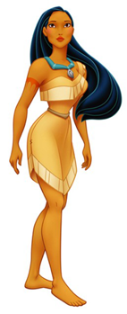
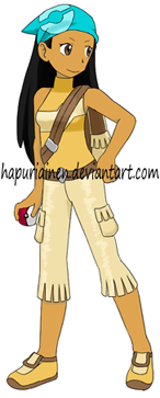
The old design was passable enough and I don't really care about the character so I didn't do anything about it. I do like the new picture a lot though, her face turned out cute here. |
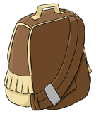
|
I wanted to give one of the characters a bag like this, and Pocahontas was an obvious choice with her asymmetrical one-sleeve dress. The colours turned out pretty boring, but then I thought that not everyone has to have a bright and colourful bag, and in my opinion the brown one suits Pocahontas pretty well. Now that I think of it, this bag might not be all that good in real life (judging its shape and how all the weight is on just one shoulder). Oh well... |
| Mulan | |
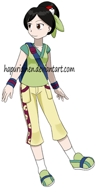
|
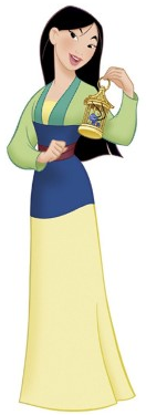
Arrr Mulan. She's my favourite Disney Princess, but quite frankly designing an outfit for her is a real pain. Her clothes give a nice and calm colourscheme to work with, but what else? A plain yellow skirt (/dress?) with no interesting cuts, a plain green shirt with no interesting cuts, a plain... etc. What am I supposed to do with that? Last time I pretty much gave up and didn't even try to do anything fun with her. This time was no easier and I'm already thinking that the old design might have been better... |
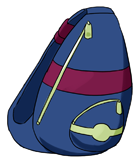
|
Uhh... Nothing about this one either. The colouring makes it pretty impossible to be recognised as Mulan's, but I didn't want to stuff too many colours in large patches to the outfit so red and blue were left for the bag. Maybe I could have had more yellow in it? |
| Tiana, from the Princess and the Frog | |
|
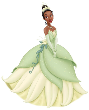
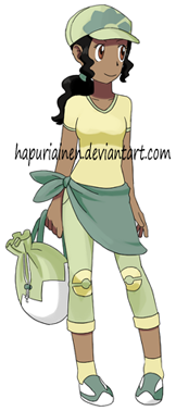
Apparently the old design had its fans too so some people might not like the complete redesign of the outfit. But I never liked the old design (horrible colours, it was completely random and made little sense, didn't fit the character) so I'm very glad to see it gone. I think the practical Tiana would prefer this one too when it comes to traveling through nature. She now has a bandanna on her hips. It's pretty silly, but I couldn't think of anything else to represent the dress design. And Ariel has a bandanna on her hips too... Should have given her the neck bandanna instead. Unsure about the shirt for it's so plain and boring, but it was the last thing I designed for her and I thought that since there were enough stuff going on already it'd be best to avoid any more detail. Wait, May's Emerald design has almost the same shoes? Damn... |
|
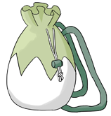
Tiana was one of the very few characters to have some kind of a bag in the old designs. Now the old bag makes it reappearance, slightly enlargened and in better colours. This too might not work in real life, carrying hard and angular objects in a backpack like that sounds very uncomfortable, and the thin straps would probably cut into your shoulder if the bag was heavy. But Misty had a similar one for hundreds of episodes so I can give one to my pokemon designs too right? The pattern is slightly different here... the one in the full body pic is the right one. |
| Charlotte la Bouff, from the Princess and the Frog | |
|
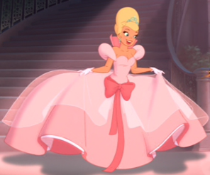
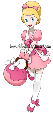
Charlotte is not a princess or even a main character, but I've always liked her and she wants to be a princess so much so she's included. I liked her old design enough so no chances there, except again I had to change the hair colour. What was with the obsession with the horrible bright yellow? Did I copy it from Bianca to get an official pokemon blonde hair colour or something? ...nope, doesn't seem to be the case. Apparently I used a bit darker pink too this time. Managed to give her a bit more active pose. Pity though that I messed the proportions a bit and now she looks shorter than the rest. I've had the same height lines sketched on the paper ever since the first Pokemon Princesses project, but I still manage to mess up from time to time. |
|
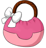
Not satisfied with Charlotte's bag. Girly stuff is easier to draw (more freedom, boy or boyish clothes automatically forbid about half of my repertoire) so I believe I could've managed something more interesting for the super girly Charlotte. Not that there's anything particularly wrong with this one either, but it could be a lot more. |
| Rapunzel, from Tangled | |
|
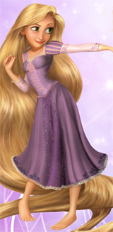
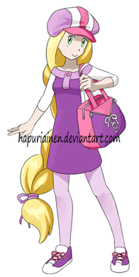
I like the new version a lot more than the old one, but I still wish I could've done it even better considering she's one of my favourite princesses here. Threw away the old silly hat and replaced it with... another silly hat. But I love caps like that so haters gonna hate, I like the characters so she's going to get one. I guess I could've done a bit better job with its colours. She too, like Ariel, got shoes that would be a bit more suitable for walking around in the nature. And long sleeves too, there was this trend towards less revealing clothes in the redesigns. While the dress remained mostly the same I managed to move the somewhat out-of-place ribbon away to the shoes. And the striped thights didn't really work and I like the strips much better in the hat. Her hairstyle got a drastic change from having her hair flow open, but I thought she might have trouble with that if she had to trek trough forests and stuff. And I also changed the colour to a less bright yellow (the old one was pretty ugly). Her pose is annoyingly close to Rosa's. I didn't copy it and if I had remembered that there already was official art with a very similar pose I would've probably tried something else. |
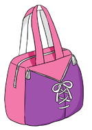
|
Not really happy with this one. There were nice ideas going on, but in the end it turned out a bit boring. And it's too pink. That is supposed to be two little pockets with zippers. The ribbon is just for decoration. |
| Merida, from Brave | |
|
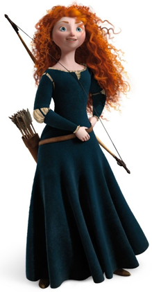
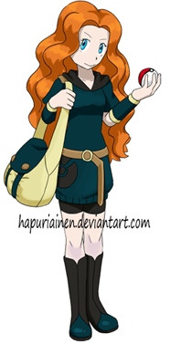
I found Merida's old design somewhat odd but by now I've grown to like it. So no chances there, except I like the shading of her hair better now. She was unfortunate to get a pretty static pose. Being one of my favourites should warrant a better one, but the ones I tried wouldn't work, or they were too close to Aurora or Ariel's. |
|
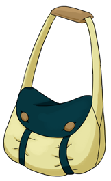
Out of ideas with this one. Merida's dress is so plain that it gave very little to work with even for the outfit, and now I had to squeeze even more out of it for the bag, which didn't end too well. I would very much have wanted to use the blueish green as the main colour for the bag too, but it was pretty impossible with almost her whole outfit being the same colour. |
| Vanellope von Schweetz, from Wreck-it-Ralph | |
|
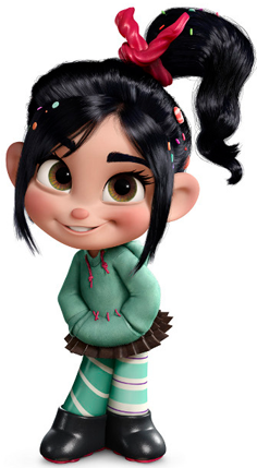
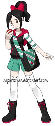
Vanellope was a somewhat confusing experience but at the moment I'm happy with the result. There's the typical problem with the Vanellope's original outfit: it's pretty normal, almost everyday clothing (as opposed to poofy ballgowns) that it could practically be a pokemon outfit even if I didn't do anything to it, and pokemonifying such characters is usually either boring (just drawing the reference in pokemon style, no artistic effort needed) or difficult (trying to avoid copying). Vanellope's outfit gives a lot to work with (the licorice in her hair, the tiny candies in her hair, the hoodie, the hoodie straps, the pocket, the stitches on the pocket, the shape of the skirt, two different stripes), but at first I had serious problems with the previous issue. Here is what I managed to create in an earlier attempt I luckily never uploaded anywhere. I hate the old attempt, everything is so forced in it, or just directly copied from the reference. The second attempt turned out a bit more succesful when I stopped trying to make the same "skirt must be brown, shirt must be turquoise". Or that she even has to have a skirt in the first place. While the character wasn't feminine at all she still had a skirt and lots of hair decorations, so I wanted to have something girly in my design as well. So she has the standard bow in her hair to compensate for the missing skirt, and I think I managed to balance the boyish and girlish features pretty well. I did use a similar sleeveless hoodie for Cinderella though, but I can think that the white part is just a collar and not a hood, and it was more skin-tight anyway. I dunno, maybe my design is a bit too busy. But that's partly because of the bag, the sketch of just the character and outfit looked less messy. |
|
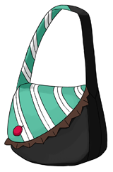
This is not exactly what I had in mind and I'm not all that happy with the result, but I guess it's ok. The two-tone bag and strap was a nice idea, but it would have needed more work. While sometimes the bags were a pain to design here I was very happy about them, since Vanellope had so many details I wanted to use. So now I could shove the double-stripes and the shape of the skirt to the bag instead of trying to stuff everything to the outfit (with disastrous results). |
| Anna, from Frozen | |
|
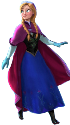
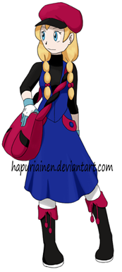
Aaaand after I've drawn her a nice pokemon outfit from the promotional art I found on a Wiki they reveal a completely different design for her instead! What is this supposed to be?! (I take no responsiblity for being impatient) And I wouldn't be suprised in the least if even this wasn't what she'll really look like in the movie and I might have to redesign her for a third time... Not to mention I liked the previous design a lot more. The new one is just a boring generic barbie face... HNGGGH The old one is infinitely better, why did they have to ruin everything!? I liked the old design quite a lot so I didn't change it much. The old colours were better though... And I don't like the light blue on the glove at all, I might have to change it to something else. But where should I put it then? Not sure what to think of the new hairstyle. At least it's something new and not close to Merida's, but I'm fairly sure I would have liked to have the old one in the movie. Really liking the overall pose/face for the doll, I think it turned out cute. |
|
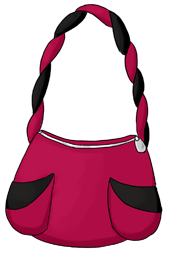
I had no ideas for this one. Or the only one I had, the tiny bobbles from the cape, just wouldn't work; they were too small. In the end the only thing I could think was the strap which isn't very impressive. |